
In today’s digital age, the rapid rise of smartphones and mobile devices has transformed the way people interact with the internet. As the world becomes increasingly mobile-centric, businesses need to adapt and ensure their online presence is optimized for mobile users. In this blog, we’ll explore the importance of mobile-friendly websites and how they can help you reach a broader audience, improve user experience, and drive significant growth for your business.
Mobile is the New Norm:
Mobile devices have become an integral part of our daily lives. From browsing the internet to making online purchases, people now prefer using their smartphones and tablets for convenience and accessibility. If your website isn’t mobile-friendly, you risk losing potential customers to competitors who have already embraced the mobile revolution.
Improved User Experience:
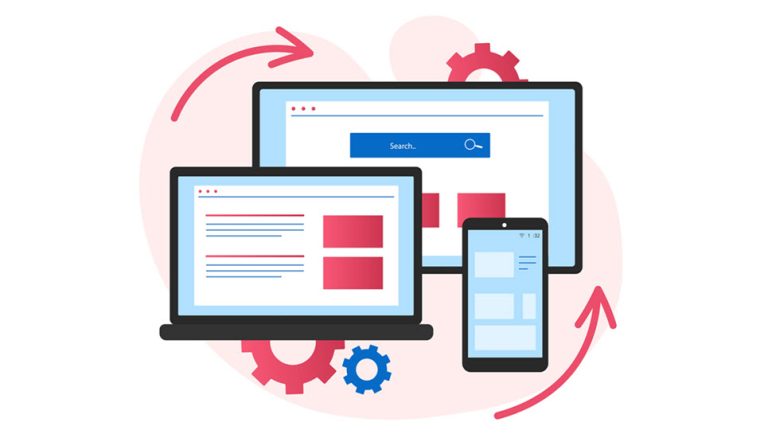
A mobile-friendly website is not just about fitting content on a smaller screen. It’s about creating a seamless user experience that caters to mobile users’ needs and preferences. A responsive website design automatically adjusts its layout and elements based on the device, providing a user-friendly interface. By offering a smooth and intuitive experience, you’re more likely to keep visitors engaged and encourage them to explore further.
Enhanced Search Engine Rankings:
Search engines like Google prioritize mobile-friendly websites in their search results. With the increasing number of mobile users, search engines now emphasize the importance of mobile optimization as a ranking factor. A mobile-friendly website signals to search engines that you’re offering a quality experience to your users, which can boost your search rankings and organic traffic.
Reach a Wider Audience:
Mobile devices have opened up new avenues for customer engagement, especially in emerging markets where mobile internet access may be more prevalent than traditional desktop usage. By optimizing your website for mobile, you expand your reach to a broader audience, tapping into a vast pool of potential customers who prefer mobile browsing.
Faster Page Load Times:
A mobile-friendly website is designed to load quickly on mobile devices. Page speed is crucial in today’s fast-paced digital landscape, as users expect instant access to information. A slow-loading website can lead to higher bounce rates and a negative user experience. With a mobile-friendly design, you ensure your visitors can access your content swiftly, increasing the chances of converting them into loyal customers.
Conclusion:
Embracing mobile-friendly website design is no longer optional; it’s a necessity for businesses aiming to thrive in the digital era. By optimizing your website for mobile users, you can enhance user experience, reach a broader audience, and potentially drive substantial growth for your business. As mobile usage continues to soar, investing in mobile-friendly web design is a strategic move that will undoubtedly yield long-term benefits. So, take the leap into the mobile-first world and unlock the potential to connect with more customers than ever before.